
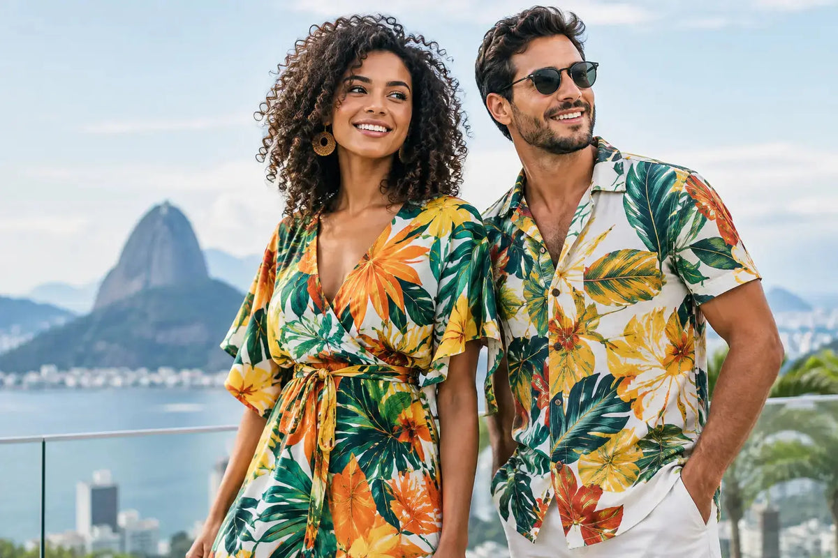
The best outfits earn their place before you leave the house. They feel good at the kitchen table, look pulled together when someone suggests brunch, and do not make you want to change before friends drop by. That is the appeal of Brazilian print clothing: expressive color and artful pattern, grounded in pieces you can actually wear on repeat.
This is not about treating a print like a special occasion. It is about bringing a little more personality to the routines that fill a real week: school pickup, a long travel day, a Saturday sleepover, coffee on the porch, or a casual reservation somewhere with a table. When the fit is right and the fabric has softness with shape, a vivid print becomes surprisingly easy to live in.
Why Brazilian Print Clothing Feels So Alive
Brazil is often reduced to a postcard palette: bright beaches, tropical leaves, carnival color. Those references can be joyful, but the most memorable Brazilian-inspired design has more range than that. Rio de Janeiro, for example, is a city of graphic sidewalks, sun-faded buildings, tiled staircases, ocean curves, hillsides, and saturated color set against concrete. There is movement everywhere, but also geometry.
That tension is what makes a strong print feel modern. A wave pattern can feel clean rather than costume-like. Citrus orange can look sharp next to a crisp neutral. Pink can be electric, then unexpectedly wearable when the silhouette is simple. The point is not to dress as a vacation fantasy. It is to wear color with enough intention that it fits your ordinary life.
Original artwork matters here. A print designed with a point of view has rhythm, scale, and a reason for every color choice. It does not rely on generic tropical motifs to do all the talking. Look closely and you should see a pattern that still feels interesting after the first compliment.
Comfort Is the Difference Between Looking Good and Wearing It
A beautiful print on a stiff, fussy garment has a short shelf life. You may wear it once for the photo, then let it sit in the back of a drawer. Brazilian print clothing works hardest when the piece is comfortable enough for the moments nobody posts: answering emails in bed, packing snacks, folding laundry, lounging after a flight.
Soft knit fabrics are especially useful because they can move between settings without becoming sloppy. They have ease, but they also hold enough structure to look intentional with sandals, sneakers, or a clean pair of slides. A matching shirt and pant set can read like pajamas at 8 a.m. and like a relaxed coordinated look by 6 p.m. The difference comes down to fabric weight, cut, and styling.
Fit deserves equal attention. A women’s top should not be a smaller version of a men’s top, and a kids’ set should not feel like an afterthought. Body-specific cuts make coordinated dressing feel considered instead of costume-y. The right shoulder placement, rise, sleeve length, and proportion let every person wear the print their own way.
That does not mean every piece needs to be close-fitting. Some days call for an easy shirt with room to move; others call for a dress that skims without clinging. The goal is comfort with presence. Soft where it counts. Honest everywhere else.
How to Wear a Bold Print Without Overthinking It
The quickest way to make a print feel wearable is to let it be the strongest visual element in the outfit. If you are wearing a colorful printed dress, keep the rest simple: a familiar sandal, small hoops, a light layer if the weather turns. You do not need matching accessories, a themed bag, or a complicated styling story.
For printed sets, the built-in coordination does a lot of the work. Wear the full set when you want an immediate look, then separate the pieces when you want more options. A printed shirt can work with denim or a solid short. Printed pants can pair with a white tank, a soft neutral tee, or a cardigan in one of the quieter colors found in the artwork.
Color is often less difficult than people expect. Instead of trying to match every shade in the print, choose one direction. Pull out a bright accent for a playful look, or choose a neutral that gives the print room to breathe. Black, cream, sand, denim blue, and clean white are reliable partners, but a carefully chosen pink, orange, or sky blue can be just as easy when it repeats a color already in the pattern.
Scale also changes the mood. A large, graphic print usually feels bolder and more fashion-forward. A smaller repeat can be softer and easier to layer. Neither is better. It depends on whether you want the outfit to lead the conversation or simply bring a little light to it.
Let the Occasion Set the Styling Level
For a slow morning, a printed pajama set needs very little beyond coffee and bare feet. For a host-at-home afternoon, add a polished slipper or sandal and a simple gold earring. For errands or travel, layer a printed shirt over a tank or pair printed pants with a solid jacket. The outfit still feels relaxed, but not like you forgot to get dressed.
For dinner or a low-key event, a print dress or elevated matching set can take you there with cleaner accessories and a little more shape. A structured bag, a sleek sandal, or a defined waist changes the energy fast. You do not have to abandon comfort to look ready for plans.
Coordinated Family Outfits Can Still Feel Personal
Matching family outfits have a reputation problem, and honestly, it is earned when everyone is put into the exact same scaled-down garment. Coordinated dressing works better when it is treated as a color system rather than a uniform.
Start with a shared print, then let each person choose the silhouette that fits their day. One person may prefer a relaxed button-up, another a soft dress, another a pajama set, and kids may want the piece that lets them run, climb, and sprawl on the floor. The result looks connected in photos without flattening anyone’s style.
This approach is also more practical. Adults can wear their pieces separately later, kids get clothing that feels comfortable rather than overly precious, and the matching moment does not have to be limited to one holiday card. A coordinated look can be for a family trip, a birthday breakfast, a sleepover, or simply a lively morning around the kitchen table.
At Pip & Moon, that is part of the design idea: original Brazilian-inspired prints that can move across women’s, men’s, and kids’ pieces without forcing everyone into one template. A shared palette makes mixing and matching easier, especially when one person wants a full print and another prefers a quieter solid.
What to Look for Before You Buy
A print may catch your eye first, but a few practical details determine whether it becomes a favorite. Check the fabric description and think about the season you will wear it most. A breathable knit is useful year-round in climate-controlled homes, but you may want a lighter layer for hot outdoor days or something with more coverage for travel.
Look at size guidance instead of assuming your usual size will translate perfectly across silhouettes. An oversized sleep shirt, a fitted dress, and a relaxed pant are meant to fit differently. If you are buying for a group, measure a well-loved garment at home when possible. It saves the back-and-forth and makes the first wear more likely to be a good one.
Finally, consider cost per wear with a little honesty. The most versatile printed pieces can go from bed to brunch, from vacation packing to gift giving, and from solo outfits to coordinated family photos. A limited capsule may feel special, but it should still work with the clothes you already own.
Choose the print that makes you smile, then choose the cut that makes you reach for it on a regular Tuesday. That is when color stops being a statement piece and starts becoming part of your life.
Comments